You actually don’t need jQuery to simply find the user’s screen resolution size. It’s fairly simple with plain old javascript.
Your current screen resolution is:
<script>
var width = window.screen.width;
var height = window.screen.height;
document.write('Your current screen resolution is: '+w+'x'+h);
</script>
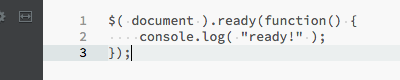
If you’re looking for something a bit more complicated that gets the viewport, meaning the actual size of the users of the browser window, and watches for changes in the size of the viewport, jQuery is great for that. The below example does this. It also make sure jQuery is loaded and only once.
Your current browser viewport size is:
<h4>Your current browser viewport size is: <span id="screenresolution"></span></h4>
<script>
if(!window.jQuery){
    var script = document.createElement('script');
    script.type = "text/javascript";
    script.async = true;
    script.src = "https://ajax.googleapis.com/ajax/libs/jquery/3.3.1/jquery.min.js";
    document.getElementsByTagName('head')[0].appendChild(script);
    jQuery.noConflict();
}
jQuery(document).ready(function($){
    function getViewportSize(){
        $("#screenresolution").html($(window).width()+'x'+$(window).height());
    }
    getViewportSize();
    $(window).resize(function() {
        getViewportSize();
    })
});
</script>